Visual Identity
Our visual elements express who we are and help us stand out in our market. It’s vital that we use fonts, colors and images correctly and consistently across all marketing channels.
LogoClick here to download assets.
Our logo, including our iconic acorn, highlights the role we play in helping our customers and communities grow. It also hints at our deep local roots. As a symbol of our brand, the logo should be treated with respect and only used in the following ways.
Primary Logo
Secondary Logo
Clear Space
Minimum Width
Keep Clear Space Around the Logo
Always maintain a “safe” area around the logo, equal to the size of half of the acorn square.
Make It Prominent
The logo should stand out in any format. In print, the logo’s minimum width is 1.25 inches.
ACCEPTABLE ONE-COLOR ALTERNATIVES
Our logo should only be used in Reflex Blue, white or black.
Misuse of the Logo
DON’T Change or Distort the Logo
Only the above logos should be used. Never alter the logo’s colors, typeface, or the positioning, proportion or spacing of the letters.
Use only the approved logo colors.
Use only the approved logo file and do not change the font.
Do not distort, stretch or scale the logo file.
Do not tile, turn or rotate the logo.
Do not change the logo letter spacing.
Do not fade or watermark the logo.
Do not apply graphic effects to the logo.
Do not place the logo on a complex background.
Exception
Upon approval from Marketing, our single-line logo may be used in place of our stacked logo, but only in situations where the standard logo won’t fit: in branch locations, on certain signage and on promotional items.
TaglineClick here to download assets.
Our motto is also our tagline and is used in marketing materials whenever possible. It can stand alone, appear in a lock-up with our logo, or appear within ad copy. When in body copy, it can use the same font as the body copy but should always be italic. In all other cases, download and use the approved tagline word mark, which uses American Retro font. When space permits, using our primary logo (the tagline and logo lock-up) is preferred.

In limited situations, such as branch decor, these alternate versions are used:
 Click here to download assets.
TYPOGRAPHYClick here to download assets.
We use clean, simple typefaces to show that we are modern and accessible. Helvetica should be used as a substitute in applications such as Microsoft Word and PowerPoint, as well as in applications where primary fonts are unavailable, such as emails.
Print Fonts – Headlines
Melbourne Regular:
abcdefghijklmnopqrstuvwxyz
Melbourne Bold:
abcdefghijklmnopqrstuvwxyz
Print Fonts – Body Copy
Century Gothic Pro Regular:
abcdefghijklmnopqrstuvwxyz
Century Gothic Pro Bold:
abcdefghijklmnopqrstuvwxyz
Web Fonts – Headlines
Kirvy Regular:
abcdefghijklmnopqrstuvwxyz
Kirvy Bold:
abcdefghijklmnopqrstuvwxyz
Web Fonts – Body Copy
Helvetica Regular:
abcdefghijklmnopqrstuvwxyz
Helvetica Bold:
abcdefghijklmnopqrstuvwxyz
Color PaletteClick here to download assets.
Our color palette is calm and comforting. These colors visually represent our personality as a dependable and approachable financial partner.
These are the approved Ridgewood Savings Bank colors.
Primary Colors
One or more of our primary colors should be used on all marketing materials to maintain brand consistency. Our logo’s standard color is Pantone Reflex Blue.

PMS Reflex Blue C
CMYK 100, 94, 14, 12
RGB 39, 50, 123
HEX 27327B

RSB Web Blue
CMYK 95, 71, 8, 1
RGB 19, 89, 157
HEX 13599D

Lime Green
CMYK 50, 0, 99, 0
RGB 141, 199, 65
HEX 8DC741

RSB Light Blue
CMYK 69, 18, 0, 0
RGB 53, 166, 222
HEX 35A6DE
Tints of 5% and 10%
for use as accents backgrounds, etc.
Secondary Colors
These colors supplement our primary colors to add visual interest. Secondary colors are often used for accents, icons, gradients and other graphics.

Medium Blue
CMYK 98, 34, 8, 0
RGB 0, 133, 191
HEX 0085BF

Kelly Green
CMYK 64, 22, 100, 5
RGB 106, 151, 63
HEX 6A973F

Hunter Green
CMYK 87, 44, 92, 52
RGB 13, 69, 38
HEX 0D4526

80% Black
CMYK 0, 0, 0, 80
RGB 88, 89, 91
HEX 58595B
For body copy: tints of 5%, 10% and 15% for use as accents backgrounds, etc.
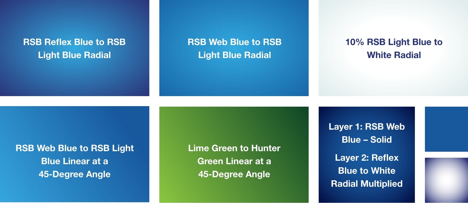
Color Gradient Uses
Gradients can be used as a background or for large headlines, icons and other graphics. They can flow in different directions and use several different color combinations:
PhotographyClick here to download assets.
Our bank is built on relationships and personal stories. The right photo selections bring these qualities to life. We use two primary types of photography.
“Candid” Lifestyle Photos – No Eye Contact
- Use images that look authentic, not posed.
- Choose photos that show emotion and include natural light.
- Choose an image that fits with the headline to tell a story.
- Prioritize diversity in age and ethnicity.


“Portrait” Photos – With Eye Contact
- Photos may appear as cutouts that are integrated with our “swoosh” graphic.
- Use these to portray specific demographics (such as students, families or business customers).
- You can also represent members of our team, especially when highlighting Ridgewood’s service.
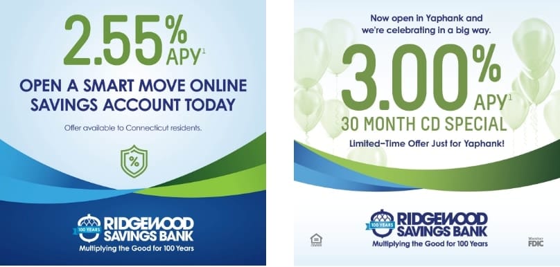
NumbersClick here to download assets.
When advertising a promotional rate or highlighting another number, the number is featured in place of a photo or other graphic.
IconographyClick here to download assets.
Our suite of icons serves a functional role by emphasizing key points and product benefits and makes layouts visually engaging.
Icon Application
- Size icons so they are easily understood but do not overshadow the copy.
- Scale icons proportionally so each icon maintains a consistent stroke weight.
- Icons should not be a dominant focal element on a page.
We use lineal icons for a lighter layout. They can appear as one solid color, gradients of two colors at a 45-degree angle or two-color, as shown below.
Always Use These Icons for Our 6 Core ValuesClick here to download assets.
Relationships
Financial Solutions
Convenience
Competitive Rates
Giving Back
Strength & Stability
BulletsClick here to download assets.
You may use bulleted lists in a brand color when describing product features or other details.
For benefits or affirmative statements, check marks can be used in place of bullets (in one of our brand colors in either a solid color or gradient.)
Design ElementsClick here to download assets.
These creative elements can be used in a variety of formats to give our marketing materials greater impact.
The Swoosh
The swoosh is our primary graphic element. In all cases the swoosh is a framing element, used to frame full bleed photos or call out text like a rate. It can also separate the layout – framing the header, footer or sidebar. There are 6 main uses of the swoosh:
- The original swoosh with four main areas of color at an asymmetrical angle.
- This is the original swoosh, used as a background element with clipped-out imagery on top.
- This swoosh is made up of three main areas of color, one of which is larger than the others.
- A thinner, symetrical version of the swoosh for tighter layouts.
- The monochromatic swoosh, which uses the same gradient at opposite angles.
- A monochromatic watermark version of the swoosh, used as a background pattern.
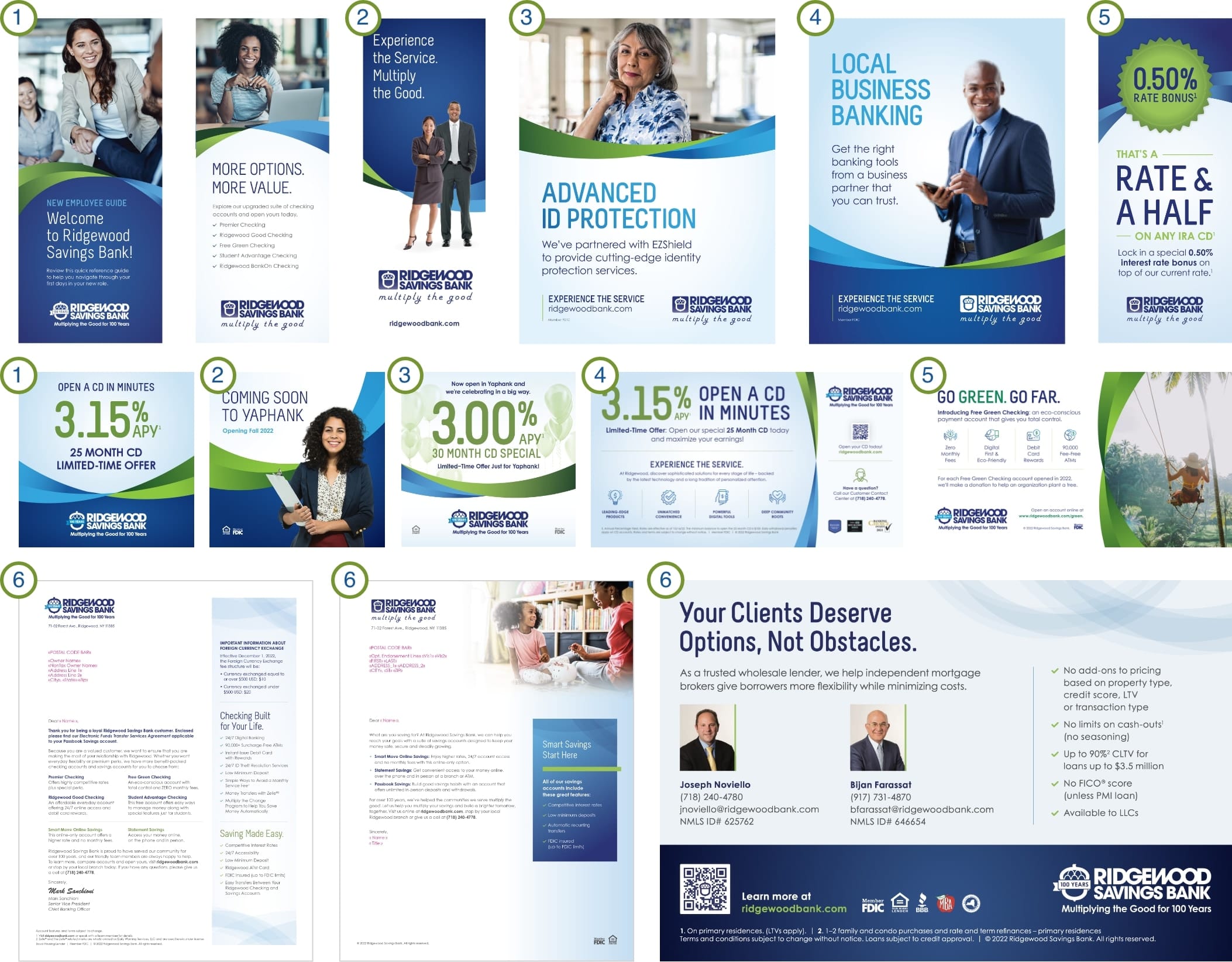
Swoosh Application
- Do not stretch or distort this graphic.
- Make sure the gradients flow in opposite directions. This creates the layered effect.
- Only use the swoosh in layouts that provide enough space.
- The swoosh can rotate to balance with the text and other graphic elements.
Design ElementsClick here to download assets.
The Acorn
The acorn symbol from our logo should always appear in brand colors. It can appear alone in certain situations, such as branch signage, ATM surrounds and on promotional items. It can also be used as a supportive design element on more content-heavy pieces.
Acorn Application
- It can be used as a watermark at 5%–10% transparency.
- It can be used for bullet points on a list or timeline.
- It can be a badge for prizes or page numbers.
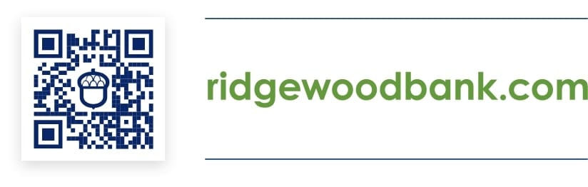
- The standard acorn appears in Reflex Blue and the inside is transparent, including the inside of the arches.
- QR codes contain the acorn as their center element.

Additional ELEMENTS Click here to download assets.
Social icons | Awards | FOOTER CONTENT | QR code | RFS Logo | Contact | Email Signature
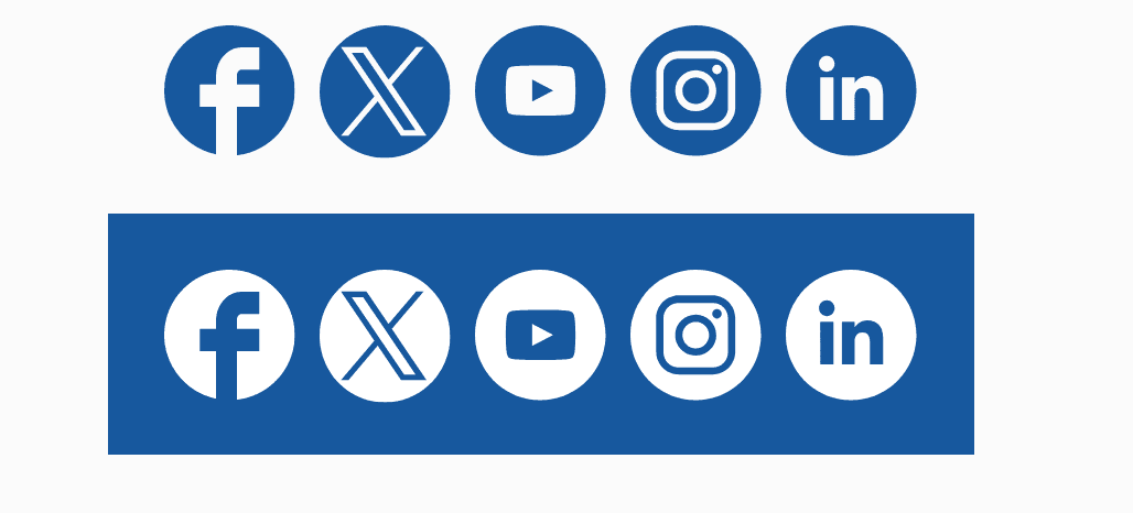
Social Media Icons (Optional)
Social icons can appear with and without the text “CONNECT WITH US” and can be in color or white on a colored background. When space allows, these can be placed in the footer. They should not appear higher up than the Ridgewood logo.
CONNECT WITH US
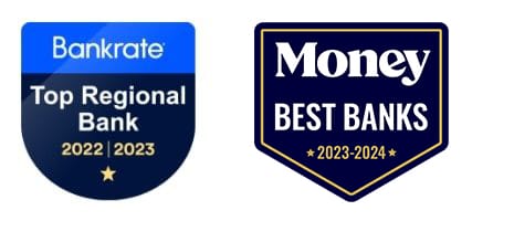
Awards (Optional)
We include recent awards when there is sufficient room.
- Only mention awards from the current/previous year.
- Don’t include awards on evergreen materials that can’t be easily updated.
Collateral Coding
All print pieces include a small code that will be provided by Marketing. It appears on the bottom right of the footer (or back page) in the same type size as the copyright line.
Footer Content
Include the FDIC statement except when discussing Ridgewood Financial Services specifically. Ensure that Equal Housing Lender appears on all mortgage-related materials.
Include a copyright line unless space is limited.
The FDIC and Equal Housing Lender statements can appear as text or graphics.
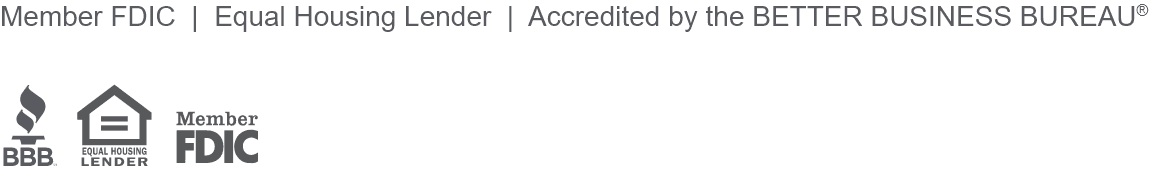
© 2024 Ridgewood Savings Bank
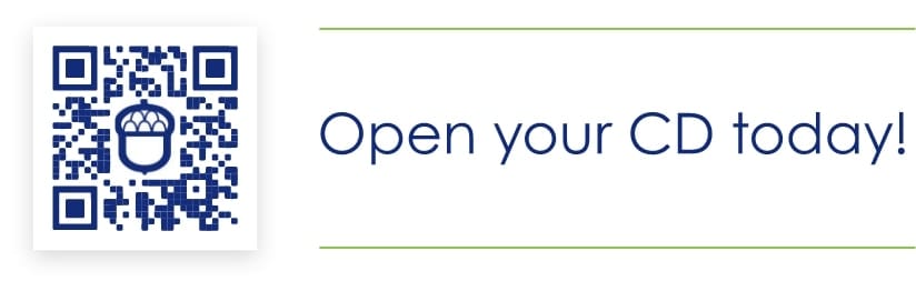
QR Code Usage
When using a QR code, include a short CTA.
It can be paired with or without rules depending on the layout. The QR code image box should have a subtle drop shadow.
When the QR code links directly to an application process (as opposed to a landing page), any required disclaimers must be included in the piece.
Design ElementsClick here to download assets.
Ridgewood Financial Services (RFS) Click here to download assets.
Important:
- RFS social media posts are not allowed.
- Instead of Member FDIC, all RFS materials should include the non-deposit investment product and insurance disclosure:

Investment and insurance products and services are offered through Osaic Institutions, Inc., Member FINRA/SIPC. Ridgewood Financial Services Corporation is a trade name of Ridgewood Savings Bank. Osaic Institutions and Ridgewood Savings Bank are not affiliated. Products and services offered by Osaic Institutions are:

Contact Information
If space allows, make sure to include our Customer Contact Center information on any print materials.
As Part of the Message
(Letters and Notices)
You can call us at (718) 240-4778, Monday through Friday from 7am to 7pm and Saturday and Sunday from 8am to 2pm.
As a Lock-up
(Brochure, Booklet, Buckslip, etc.)
Contact Center
(718) 240-4778
Monday – Friday: 7am – 7pm
Saturday – Sunday: 8am – 2pm
Email Signatures
To keep our email signatures simple, professional and consistent, Ridgewood team members are encouraged to follow this format. We prefer that quotes are not added to the signature line.
- All text is Arial. Your name should be 12 pt. font and the rest of the text is 11 pt. font.
- Name is bolded in blue, and all other text is regular black. Please see the color grid for the correct blue.
- Include one space after your name before your title and one space after the website address before the logo.
- (If applicable) Include NMLS ID# or other certification or license info directly below your title.
- “O” and “M” for office/mobile number is also bolded, in blue.
- Primary logo appears last.
Jane Smith
Retail Mortgage Consultant
NMLS ID# 123456
Ridgewood Savings Bank
71-02 Forest Avenue, Ridgewood, NY 11385
O (123) 456-7890 | M (123) 456-7890
jsmith@ridgewoodbank.com
ridgewoodbank.com![]()

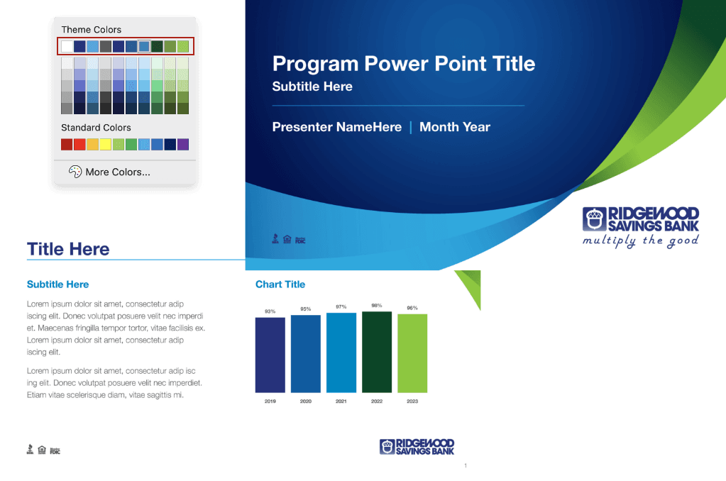
Powerpoint TemplateClick here to download asset.
To adhere to our current brand standards and maintain consistency throughout internal and external presentations, Ridgewood has developed a PowerPoint template for all team members to use. This template features a professional and cohesive layout that seamlessly integrates Ridgewood’s color scheme, typography and logo usage rules, as well as the required regulatory and compliance icons.